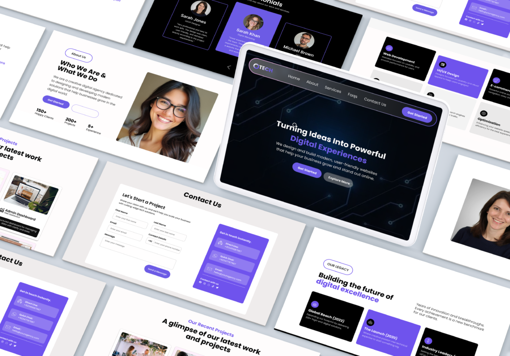
OTECH a digital agency site built to close, not just impress
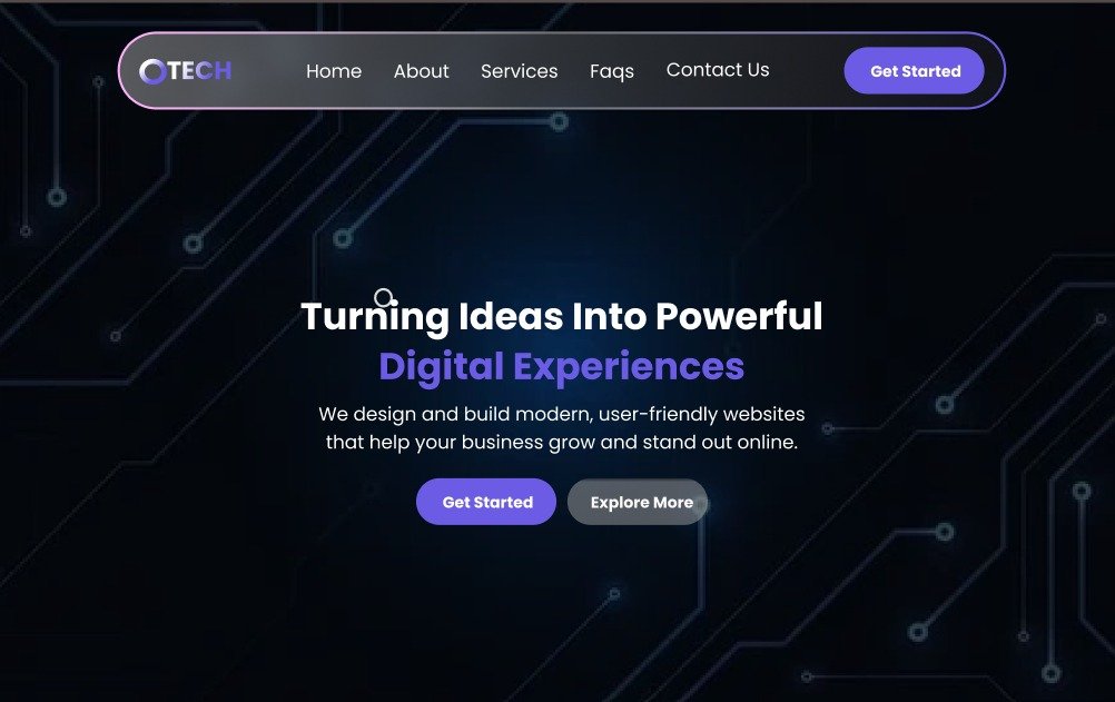
A dark, glassmorphic platform for a creative agency offering UI/UX, web development and scalable digital solutions — designed around fast comprehension of services, pricing and timelines.
Agency sites like this tend to bury the things a prospect actually needs — pricing, timelines, what’s included — under cluttered navigation, which drags down conversion.
Goal
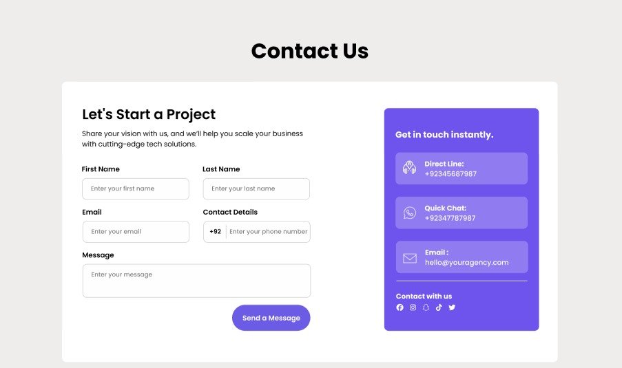
An interface built around dark-mode styling, transparent visual feedback, clear pricing, and a contact flow a visitor can reach in seconds, not clicks.
Design system
Deep space backgrounds with a single electric-purple accent, kept disciplined rather than scattered across every element.
Deep Space
Surface
Deep Space
Purple Soft
Type / White
Muted Gray
Design system
Like this direction?
Let’s design your agency’s site with the same clarity.